Pareto Charts
Once you have found a central constraint and want to get right to work on it, a very common next step is to find out what are the “Big Rocks”? See Sluice Analogy. This is where Pareto charts enter the picture.
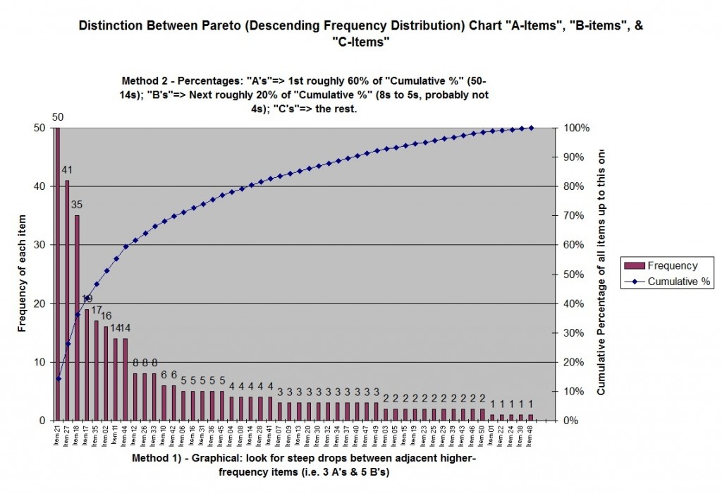
Pareto charts are a widely useful tool in process improvement. This is the old 80/20 rule on steroids. The idea is that you do not deal with high-frequency items the same way you deal with low-frequency items. How you operationalize that in a given process setting involves several steps. See the accompanying Distinction between Pareto Chart A, B and C Items to use as both an example as well as a (calculations already installed) template.
The process can be outlined as follows:
1. List the challenges/defects/mistakes etc. in the process that you are currently dealing with as well as their frequencies.
2. Sort them in DESCENDING ORDER by how frequently they occur.
3. Install calculations to show the cumulative percentages across the entire descending order range of the items in your list.
4. Decide what are the “A-items” (boulders), what are the “B-items” (pebbles) and what are the “C-items” (sand).
There are two methods available to you as examine the following graph:
Graphical Method
Essentially, you look for steep drops on the graph between the initial (higher frequency) items and their immediately adjacent items. The first such steep drop constitutes the boundary between the high frequency “A-Items” and the medium frequency “B-items.” The second such steep drop constitutes the boundary between the medium-frequency “B-Items” and low frequency “C-items.” For example, in the above graph, this method would lead you to 3 “A’-Items” & 5 “B-Items”, the first 8 items in total. The “C-Items” are all the rest.
However, sometimes there is not a clear, immediately adjacent steep drop, so you can use the “Percentage Method” as an alternative. Note that the Percentage Method can produce different ranges than the Graphical Method.
Percentage Method
The first roughly 60% of the cumulative percentage (in this example all of the items between frequency of 50 and 14) constitute the high frequency or “A-items”. The next roughly 20% of the cumulative percentage items constitute the “B-items” or medium frequency items. In this example, down to and including the “5’s” but probably not the “4’s”. Or, in other words, the “A-Items” and the “B-Items” include the first 18 items. This is very different than the Graphical Method. Just use whichever one makes sense for you in your application. The “C-items” are all of the remaining items.
In almost every case you deal very differently with the high, medium and low frequency items. Focus on the high frequency items first.
The point of this page is to help you to;
- Download the sample Distinction between Pareto Chart A, B and C Items Excel spreadsheet
- Substitute the item names with their frequencies
- Sort by descending frequency &
- Get a Graphical & Percentage chart for your own process.
Happy Charting!
Note: In the occasional case that a medium or low frequency item is extremely painful, use the alternate method of “Pain X Frequency” and run a Pareto diagram, complete with A, B & C items & cumulative percentages on the metric of “Pain X Frequency” instead of just on the metric of frequency.
This raises the ranking score of the extremely painful items by a “Pain” multiplier and so moves them up. However, be aware that something that is very painful but very rare, may not actually be higher priority (by your own weighting) than something that is medium-low pain but extremely frequent.

